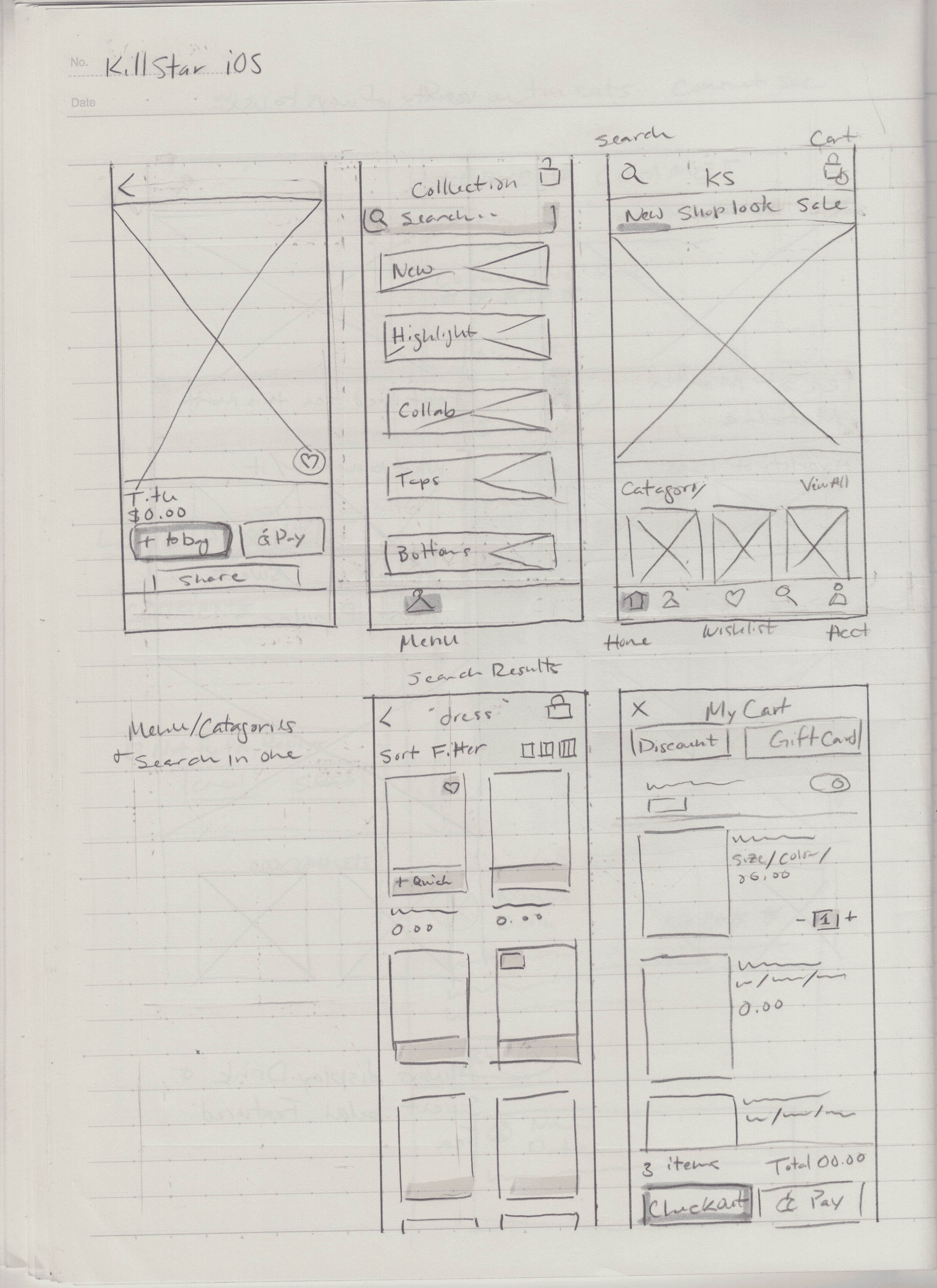
Overview

Fantasmagoria is an alternative fashion and lifestyle online shop based in Lithuania. My goal was to create a native mobile app that honors their gothic brand identity while delivering a smooth, intuitive purchase flow for both new and returning customers. This project resulted in a high-fidelity prototype for iOS and Android, tested with real users and iterated based on findings.
Research
Reviews on Google and Trustpilot were overall glowing and positive. Customers liked the products and the general aesthetic of the website. Since reviews raised no major usability concerns, I turned to the mobile site directly to identify opportunities. Some of the iconography felt a bit dated, and the screens for user profile and information could be optimized to be more mobile-friendly. Because of this, I prioritized using current native iOS and Android components to modernize the feel without abandoning the brand.


Conceptualizing

I conceptualized the main user flow and the key features a user would need to streamline their process. I also analyzed various other shopping apps — I looked at Disturbia to see how they balanced gothic branding with usability, and H&M to observe how a large-scale company meets customer needs. The insights I gathered at this stage informed my decision to move the login screen from the beginning of the flow to after adding an item to the bag.


Design System
Since Fantasmagoria already has a strong visual identity that appeals to their audience, I committed to preserving the brand and only made small adjustments to the highlight colors, so that the brand red would not be confused for an error message or notification. This ensured the brand color carried emotional weight rather than being misread as a system alert.


Usability Test


After applying the design system, I conducted moderated usability tests with 5 participants (3 Android, 2 iOS), asking them to complete a purchase from discovery to checkout. This was a significant moment given my limited experience with Android devices, so I had relied heavily on platform guidelines during the design process. The test surfaced some valuable insights:
Spacing between elements needed more room
Typography hierarchy needed to be more consistent
Branding needed to be stronger
An image on the sign-in screen was obstructing text legibility
System bottom navigation was unnecessary (Android)
Users wanted more confirmation as the purchase was being completed
After the test, I made the necessary changes to ensure legibility and ease of navigation. For the confirmation issue, I looked at Uniqlo's app for inspiration — they use a sheet to confirm when an item is added to the bag, and a dedicated screen after purchase is made, using both as an opportunity to surface related items. I applied the same thinking to my designs. For branding, I went back to the Fantasmagoria homepage, took close note of the imagery and typography, and revised my screens to better reflect what made the brand feel like itself.
Conclusion and Reflection
Initially I over-thought the differences between Android and Apple devices, which led to some of the errors caught in testing. Going forward, I know to prioritize app functionality and branding first, then make the necessary adjustments to meet iOS or Android platform needs.
A habit that really streamlined my process was continuously researching other apps throughout development and sketching competitor screens in my downtime, so I always had a reference point ready when design decisions needed to be revisited.
Features for a second iteration:
Customer service chat
Alerts for when a wishlist item is low in stock or back in stock
Notifications for when a wishlisted item goes on sale
An additional category to shop by sub-style
Test whether users want to "build outfits" using a folder system in the wishlist
Animations to confirm when an item has been added to the bag or a change has been successfully made